공식 문서를 찾는 것도 도움이 되지만 플터러 상에서 ctrl + click으로 속성들을 찾아 보는 것이 더 빠르다. 하지만 더 빠른 건 이미 알고 있는 것이다. 가급적 기억하려고 자주 쓰는 걸 정리해두었다.
* single-child widget과 multi-child widget을 구분할 줄 알아야 합니다. Container는 대표적인 single-child widget인 반면, Row, Column은 multi-child widget입니다.
* https://api.flutter.dev/flutter/widgets/widgets-library.html 모든 위젯을 살펴보실 수 있습니다. 엄청 많습니다 ㄷㄷ
* sysocoder.com/498-2/ Flutter List 클래스 정리
- Scaffold
(https://api.flutter.dev/flutter/material/Scaffold-class.html)
속성을 담는 캔버스와 같은 역할을 합니다.
appBar
body
bottomNavigationBar
FAB
floatingActionButtonLocation => FAB의 위치를 세팅할 수 있다
drawer...
resizeToAvoidBottomInset : bool 값. 기본값은 true.
키보드가 올라오면 Bottom을 축소할 것인가 말것인가에 대해서 결정함
false면 키보드 아래에 깔린다 (즉, 밀려 올라오지 않는다)
그러나 true면 키보드에 비례해서 올라간다.
그러니까 지금 아래 예시에서, 최하단의 sign up 버튼은 resizeToAvoidBottomInset이 false여러 키보드 아래로 깔린거고 그 위는 resizeToAvoidBottomInset를 true로 줘서 키보드가 올라오면 자연스럽게 밀리도록 만든 것이다.
- AppBar
scaffold의 속성으로 줄 수 있다.
(https://api.flutter.dev/flutter/material/AppBar-class.html)
title
centerTitle
elevation
leading (왼쪽)
actions (오른쪽, 여러개)
onPressed
- FAB(FloatingActionButton)
이 역시 scaffold의 속성이다.
onPressed
backgroundColor
- BottomNavigationBar
우리가 흔히 아는 그 하단 네비게이션 바입니다. Scaffold의 속성으로 줍니다.
(https://api.flutter.dev/flutter/material/BottomNavigationBar-class.html)
bottomNavigationBar를 주는 것이 일반적이지만 BottomAppBar 등 다른 위젯을 배치할 수도 있습니다.
따로 작성한 포스트가 있으니 그곳을 참고합시다.
(https://darrengwon.tistory.com/362)
- Drawer
(https://api.flutter.dev/flutter/material/Drawer-class.html)
Scaffold의 속성으로 줄 수 있습니다.
보시면 child로 ListView를 준 것을 보실 수 있는데 대개 Drawer에는 ListView를 사용합니다. 편리하거든요.
또, 해당 ListView의 children으로 DrawerHeader를 줘서 헤더를 구성하고 그 아래로 ListTile을 붙여나가는 방식으로 처리합니다.
ListTile을 눌렀을 때는 보통 작동한 후 탭이 닫히는데 이는 Navigator.pop()으로 닫을 수 있습니다.
이 의미는 Drawer가 열린 것은 다른 화면 위에 쌓인 것으로 본다는 말입니다.
class Home extends StatefulWidget {
  const Home({
    Key key,
  }) : super(key: key);

  @override
  _HomeState createState() => _HomeState();
}

class _HomeState extends State<Home> {
  @override
  Widget build(BuildContext context) {
    return Scaffold(
      drawer: Drawer(
        child: ListView(
          padding: EdgeInsets.zero,
          children: <Widget>[
            DrawerHeader(
              child: Text("Header"),
              decoration: BoxDecoration(color: Colors.blue[300]),
            ),
            ListTile(
              title: Text("Item 1"),
              onTap: () {
                print("item 1!!");
                Navigator.pop(context);
              },
            ),
            ListTile(
              title: Text("Item 2"),
            ),
            ListTile(
              title: Text("Item 3"),
            ),
          ],
        ),
      ),
      appBar: AppBar(title: Text("Drawer")),
      body: Center(
        child: Text("Drawer 예제"),
      ),
    );
  }
}
UserAccountsDrawerHeader
decoration
- Column/Row
mainAxisAlignment: 세로 축에서의 정렬 (Row는 반대)
mainAxisSize: max, min. 차지하는 공간
crossAxisAlignment : 가로 축에서의 정렬. (Row는 반대) stretch 값을 주면 쭉~ 늘어난다.
참고로, CrossAxisAlignment.baseline을 사용할 때는 반드시 textBaseline 속성을 줘야 합니다.
textBaseline: TextBaseline.alphabetic,
textBaseline: TextBaseline.ideographic
verticalDirection: VerticalDirection.up, down. column의 칠드런들의 순서를 결정.
Row를 사용할 때 종종 boxconstraints forces an infinite height 오류를 냅니다.
If you are using TextField Inside a Row then you need to use Flexible or Expanded.
(https://stackoverflow.com/questions/52442724/boxconstraints-forces-an-infinite-width)
https://stackoverflow.com/a/45990477/4652688
- IconButton
아이콘버튼과 아이콘은 다른 것입니다. 아이콘인데 누를 수 있는 버튼의 형태로 만듭니다.
icon
onPressed
- Icon
Material Palette - Material Design Icons
Choose your favorite colors and get your Material Design palette generated and downloadable.
www.materialpalette.com
Icon(Icons.change_history, size: 100,)
- Text
textAlign
style => TextSyle
TextStyle
fontSize
fontWeight
letterSpacing
fontFamily (font 지정.)
- RichText
(https://api.flutter.dev/flutter/widgets/RichText-class.html)
span과 같이 한줄로 이루어져야 하는 테스트에서 다른 효과를 주고 싶을 때 사용합니다.
text.rich와 같이 쓸 수도 있습니다.
RichText(
            text: TextSpan(
                style: DefaultTextStyle.of(context).style,
                children: <TextSpan>[
              TextSpan(
                text: "username $index",
                style: TextStyle(fontWeight: FontWeight.bold),
              ),
              TextSpan(
                  text: ""
              ),
              TextSpan(
                text: "I like my new laptop sooooooooooooooooooo much",
              ),
            ])),
- Image
image -> NetworkImage, AssetImage(YAML assets활성화 필요)
fit -> boxfit cover, fill ...
문제는 network 이미지를 가져올 때 캐싱이 안된다는 것. 이는 패키지를 설치해서 해결하자.
(https://darrengwon.tistory.com/598)
Image.asset(
  'images/bbongflix_logo.png',
  fit: BoxFit.cover,
  height: 50.0,
)
Image.network("https://picsum.photos/id/237/200/200"),
- Padding
SizedBox대용으로 Padding 사용 가능 선호합니다.
padding -> EdgeInsets.all(5.0), EdgeInsets.fromLTRB()
- Spacer
(https://api.flutter.dev/flutter/widgets/Spacer-class.html)
빈 공간을 만드는데 좋습니다. SizedBox나 Padding보다 좀 더 편리하게 공간을 만들 수 있습니다.
디바이스 크기에 대응하기 위해서는 SizedBox와 Padding에서 직접 값을 주는 것보다 Space를 통해 flex를 통해 비율적으로 값을 주는 것이 좋습니다.
Row에서 Spacer를 사용하면 가로 공간을, Column에서 Spacer를 사용하면 세로 공간을 만들 수 있습니다.
Row에서 mainAxis를 spaceevenly, spacebetween 등으로 주는 것보다 좀더 비율을 커스터마이징하고 싶다면 Spacer를 사용한 후에 flex 값을 주면 됩니다.
            IconButton(
              icon: ImageIcon(
                AssetImage('assets/comment.png'),
                color: Colors.black87,
              ),
              onPressed: () {},
            ),
            // flex 2를 주었으므로 다른 Spacer보다 2배의 공간
            Spacer(flex: 2),
            IconButton(
              icon: ImageIcon(
                AssetImage('assets/direct_message.png'),
                color: Colors.black87,
              ),
              onPressed: () {},
            ),
            // Spacer 사용
            Spacer(),
            IconButton(
              icon: ImageIcon(
                AssetImage('assets/heart_selected.png'),
                color: Colors.black87,
              ),
              onPressed: () {},
            ),
2: 1의 비율이 되었네요

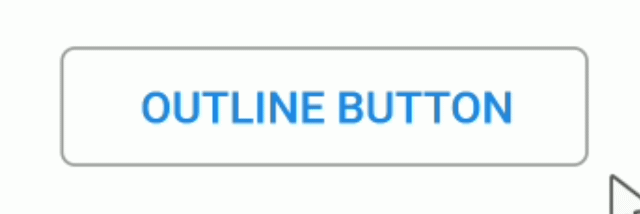
- RaisedButton vs FlatButton vs OutlineButton
누를 수 있는 버튼이란 것은 동일합니다. 좌측이 Raised, 우측이 Flat입니다. 보통 Flat은 모달 창에 해당하는 가벼운 동작에 사용하고 Raised는 무언가 (비교적) 큰 데이터를 보낼 때나 페이지 이동에 사용됩니다만, 원하는 대로 사용해도 좋습니다. OutlineButton은 말 그대로 버튼에 아웃라인만 쳐준 것입니다. transparent합니다.
이미지를 누르는 등 버튼을 다른 위젯에 감쌀 때는 FlatButton을 사용합시다 .

FlatButton으로 다른 위젯을 감쌀 때, 기본으로 패딩이 좌우로 16으로 잡혀있는 걸 주의합시다
아, 그리고 버튼 모양과 관련해서 둥글게 처리하는 코드를 작성해보았습니다.
shape 속성을 주면 됩니다.
RaisedButton(
                    color: Color(0xff485A90),
                    onPressed: () {},
                    shape: RoundedRectangleBorder(
                        borderRadius: BorderRadius.circular(24.0),
                        side: BorderSide(color: Color(0xff485A90))),
                    child: Text(
                      "FaceBook",
                      style: TextStyle(color: Colors.white),
                    ),
                  ),
-SizedBox
width
height
- Container
HTML의 div와 비슷한 역할
width
height
margin -> EdgeInsets.symeetric/fromLTRB/all
padding -> 주어진 패딩값 내에서 alignment로 상중하 좌중우(3*3 즉 9개 존재) 움직이기 가능.
alignment -> ex - Alignment.bottomRight
decoration -> shape, color, borderRadius
데코레이션은 여기저기에서 자주 사용한다.
(위젯에 준 color와 decoration에 준 color가 충돌하면 오류가 난다.)
          decoration: BoxDecoration(
            shape: BoxShape.rectangle,
            color: Colors.blue,
            borderRadius: BorderRadius.circular(15.0),
          ),
꿀팁으로, Container를 활용해서 각 원소들을 끝으로 밀어 넣을 수 있다. width 값을 double.infinity로 주면 된다.
해당 컨테이너는 길이, 높이가 없고 속성만 가졌으므로 'invisible Container'라고 불리운다.
          child: Column(
            crossAxisAlignment: CrossAxisAlignment.end,
            children: <Widget>[
              Container(
                  color: Colors.yellow,
                  width: 150,
                  height: 150,
                  child: Text("what")),
              // 아무 속성도 주지 않고 width만 무한으로 주면 invisible Container가 됩니다.
              Container(
                width: double.infinity,
              ),
- CircleAvatar
backgroundImage -> NetworkImage("url"), AssetImage ...
radius -> 독특하게 width, height가 아니라 radius로 크기 조정 (r)
- Navigator
Navigator.pushReplacement(context, MaterialPageRoute(builder: (context) => (TabPage(user))));
- Card
Row/Column/Center 등을 이용해 Container를 깍아 직접 카드 형식을 만들 수 있다. 이 경우 decoration을 통해 직접 그림자를 주고, 테두리를 깎아야 한다.
Card는 padding이 없다. (margin은 있다.) 따라서 내부의 child를 Padding으로 감싸주는 방식으로 해결합니다.
            Card(
                color: Colors.white,
                margin: EdgeInsets.symmetric(vertical: 10, horizontal: 0),
                child: Center(
                  child: Padding(
                    padding: const EdgeInsets.all(15.0),
                    child: Row(
                      children: <Widget>[
                        Icon(Icons.phone, size: 30, color: Colors.teal,),
                        SizedBox(width: 20.0,),
                        Text("+82 10 1234 1234", style: TextStyle(color: Colors.teal, fontSize: 20.0),)
                      ],
                    ),
                  ),
                ),
              ),
- GridView
(https://flutter.dev/docs/cookbook/lists/grid-lists)
(https://stackoverflow.com/questions/44183795/flutter-layout-a-grid)
GridView를 사용하는 좋은 방법은 count를 지정하는 것입니다.
crossAxisCount를 3으로 줘서 3열로 그리드를 만들어보았습니다.
pysics에 스크롤을 금지시킨 이유는 상위 위젯이 CustomScrollView라서 스크롤이 두번 적용되어 스크롤이 안되는 것을 방지하기 위해 적용한 것입니다.
  get _imageGrid => GridView.count(
    physics: NeverScrollableScrollPhysics(),
    shrinkWrap: true,
    crossAxisCount: 3,
    childAspectRatio: 1,
    children: List.generate(30, (index) => _gridImgItem(index)),
  );

  _gridImgItem(int index) => CachedNetworkImage(
    fit: BoxFit.cover,
    imageUrl: "https://picsum.photos/id/$index/100/100",
  );
Padding gridView() {
  return Padding(
        padding: const EdgeInsets.all(8.0),
        child: GridView.count(
          shrinkWrap: true,
          crossAxisCount: 2,
          childAspectRatio: 1.75,
          mainAxisSpacing: 12,
          crossAxisSpacing: 16,
          children: <Widget>[
            PopularContainer(text: "HomeCooking", imagePath: "https://picsum.photos/id/500/300/200",),
            PopularContainer(text: "Pastry Recipes", imagePath: "https://picsum.photos/id/501/300/200",),
            PopularContainer(text: "For Babies", imagePath: "https://picsum.photos/id/502/300/200",),
            PopularContainer(text: "Fuit Juice", imagePath: "https://picsum.photos/id/503/300/200",),
          ],
        ),
      );
}
- ListView / ListTitle
ListView 를 말 그대로 리스트의 형태로 보여줍니다. (가로든 세로든) (https://api.flutter.dev/flutter/widgets/ListView-class.html) 더욱 중요한 사실은 Scrollable하다는 것입니다. 리스트 뷰가 영역을 넘어가면 자동으로 스크롤할 수 있게 설정합니다. 해당 ListView가 보여지지 않을 때 cache에 유지할 List의 정도를 지정할 수도 있습니다.
children을 곧바로 주지 않고 builder로 ListView를 만들어보았습니다.
ListView.builder(
   itemCount: 15,
   itemBuilder: (BuildContext context, int index) {
     return Container(
       height: 300,
       color: Colors.primaries[index % Colors.primaries.length]
     );
ListView는 Vertical viewport was given unbounded height. 오류를 종종 내는데 뷰포트와 관련된 문제 때문입니다.
더 정확하게는 스크롤 가능한 위젯 내부에 또 스크롤 가능한 위젯인 ListView를 넣을 때 이런 문제가 발생합니다.
이럴 때는 shrinkWrap을 true로 설정해야 합니다.
또, physics을 NeverScrollableScrollPhysics()로 설정해야 스크롤이 됩니다. 스크롤 가능한 위젯 내부에 스크롤 가능한 위젯을 또 넣는 경우 이 속성을 지정하지 않으면 스크롤이 되지 않습니다.
final items = List.generate(
  10,
  (index) => ListTile(
      leading: Icon(Icons.notifications_none), title: Text("[이벤트] 공지사항")),
);
return ListView(
  physics: NeverScrollableScrollPhysics(),
  shrinkWrap: true,
  children: items,
ListView를 사용할 때 원소를 커스터마이징할 수도 있겠지만 ListTitle을 이용하는게 마음에도 편하고 시간도 절약해줍니다. ListTile
ListTile class - material library - Dart API
A single fixed-height row that typically contains some text as well as a leading or trailing icon. A list tile contains one to three lines of text optionally flanked by icons or other widgets, such as check boxes. The icons (or other widgets) for the tile
api.flutter.dev
title, leading, subtitle, enabled, onTap 등 속성을 줄 수 있습니다. Card의 child로 주로 사용합니다만 마음에 안들면 Column과 Row를 이용해서 커스터마이징하는게 빠릅니다.
- ClipRRect
child를 둥근 사각형으로 자르는 위젯입니다. border-radius를 설정한다고도 볼 수 있겠네요
다음과 같이 사용할 수 있습니다.
ClipRRect(
  borderRadius: BorderRadius.circular(8.0),
  child: Image.network((url), fit: BoxFit.cover),
));
- Table / TableRow
(https://api.flutter.dev/flutter/widgets/Table-class.html)
그리드 뷰는 자동으로 Scrollable하게 동작합니다. 그러나 스크롤하고 싶지 않은데 그리드 형식을 유지하고 싶다면 Table 위젯을 쓰는 게 좋습니다. (테이블 형식이 그리드 형식이니깐요) Table은 children으로 TableRow를 받습니다.
여기서 Expanded를 준 이유는 Table에는 크기를 조정하는 속성이 없기 때문입니다.
Expanded(
  child: Table(
     children: [
        TableRow(children: [
          Text("123"),
          Text("123"),
          Text("123"),
         ]),
        TableRow(children: [
          Text("Posts"),
          Text("Follwers"),
          Text("Follwing"),
        ]),
     ],
   ),
)
- SnackBar (context 주의!)
https://flutter.dev/docs/cookbook/design/snackbars
공식 문서에 나온대로 만들면 스낵바가 작동하지 않습니다... 이는 context 관련 문제 때문입니다.
오류 메세지를 좀 읽어볼까요?
Scaffold.of() called with a context that does not contain a Scaffold.
No Scaffold ancestor could be found starting from the context that was passed to Scaffold.of(). This usually happens when the context provided is from the same StatefulWidget as that whose build function actually creates the Scaffold widget being sought.
이러한 오류가 일어나는 이유는 스낵바를 불러온 위젯의 context가 아니라 Scaffold의 context를 사용하고 있기 때문입니다. 다른 context를 사용함으로써 이 문제를 해결할 수 있습니다.
이 경우 Builder를 통해서 새로운 context를 만들어 주고 Scaffold.of(context).showSnackBar(snackBar); 로 지정합니다.
나중에 globalKey를 만들어 currentContext를 사용해도 됩니다. 어쨌거나 같은 context만 사용 안 하면 됩니다.
class Home extends StatefulWidget {
  const Home({
    Key key,
  }) : super(key: key);

  @override
  _HomeState createState() => _HomeState();
}

class _HomeState extends State<Home> {
  @override
  Widget build(BuildContext context) {
    return Scaffold(
      appBar: AppBar(title: Text("SanckBar")),
      body: Builder(
        builder: (context) => Center(
          child: RaisedButton(
              child: Text("Show SnackBar"),
              onPressed: () {

                final snackBar = SnackBar(
                  content: Text("It is SNACKBAR!!!"),
                  action: SnackBarAction(
                    label: 'Click me!',
                    onPressed: () {
                      print("this is action button");
                    },
                  ),
                );

				# context 연결
                Scaffold.of(context).showSnackBar(snackBar);
              }),
        ),
      ),
    );
  }
}
- GestureDetecor/Inkwell
둘 다 똑같이 탭 이벤트가 없는 위젯에 이벤트를 달아둘 수 있는 위젯이지만
Inkwell을 물결 효가가 있고 GestureDetector는 시각적인 효과가 없습니다.
(https://darrengwon.tistory.com/385)
(https://api.flutter.dev/flutter/widgets/GestureDetector-class.html)
- AspectRatio
(https://api.flutter.dev/flutter/widgets/AspectRatio-class.html)
말 그대로 비율을 조정할 수 있는 편리한 위젯입니다.
AspectRatio(
      aspectRatio: 1,
      child: Container(
        decoration: BoxDecoration(
        image: DecorationImage(
           image: imageProvider, fit: BoxFit.cover),
		),
     ),
- FittedBox
특정 박스를 벗어나지 않게 고정해줍니다.
(https://api.flutter.dev/flutter/widgets/FittedBox-class.html)
fit <Boxfit> => (https://api.flutter.dev/flutter/painting/BoxFit-class.html)
alignment
딱 두 속성밖에 없다.
- Visiblity
visible 속성만 주로 사용됩니다. bool 값 받습니다.
특정 위젯을 보이지 않게 처리할 수 있습니다.
Visibility class - widgets library - Dart API
Whether to show or hide a child. By default, the visible property controls whether the child is included in the subtree or not; when it is not visible, the replacement child (typically a zero-sized box) is included instead. A variety of flags can be used t
api.flutter.dev
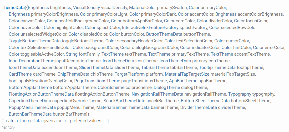
- ThemeData
(https://api.flutter.dev/flutter/material/ThemeData-class.html)
최상위 위젯인 MaterialApp의 속성입니다.
살펴보니 ThemeData.dark()를 통해서 나이트 모드를 만들기에 좋아 보인다. 다른 프레임워크 같았으면 일일히 배경색을 바꿔야 했을 것이다.
살펴보면 특정 primarySwatch와 같이 특정 위젯이 아니라 광범위하게 주는 값이 있고 tabBar Theme같이 특정 위젯의 색을 정하는 값도 있다. appBarTheme, bannerTheme, buttonColor... 필요 때마다 찾아서 적용해보자.
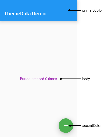
만약, 기본으로 ThemeData.dark()를 적용하고 부분적으로 다른 부분을 커스터마이징하고 싶다면 다음과 같이 .copyWith를 활용하면 된다.
    return MaterialApp(
      home: InputPage(),
      theme: ThemeData.dark().copyWith(
          primaryColor: Color(0xff0E101C),
          scaffoldBackgroundColor: Color(0xff0E101C),
          textTheme: TextTheme(body1: TextStyle(color: Color(0xffffffff)))),
    );
- PageView
(https://api.flutter.dev/flutter/widgets/PageView-class.html)
화면 전체를 슬라이드해서 화면 이동을 하게 만들 수 있는 기능이다.
그런데 이거 쓸 바에 DefaultTabBar를 써서 이동하는게 유저 경험에 더 좋다는게 개인적인 의견이다.
상단에 탭바가 없이 그냥 화면을 스와이프하는 방식으로 넘기고 싶으면 PageView가 제격이긴 하다
class Home extends StatefulWidget {
  const Home({
    Key key,
  }) : super(key: key);

  @override
  _HomeState createState() => _HomeState();
}

class _HomeState extends State<Home> {
  final items = List<String>.generate(20, (index) => "Item ${index + 1}");

  @override
  Widget build(BuildContext context) {
    return PageView(
      children: <Widget>[
        Container(color: Colors.red),
        Container(color: Colors.green),
        Container(color: Colors.blue),
      ],
    );
  }
}
- Slider, RangeSlider, CupertinoSlider
Slider.adaptive()를 통해 플랫폼에 따라 유동적으로 슬라이더의 모양을 바꿀 수 있다.
(https://api.flutter.dev/flutter/material/Slider-class.html)
여기에 슬라이더를 좀 더 잘 꾸미기 위해 SliderThemeData 위젯을 추가로 이용해보았다. SliderTheme으로 감싼 후에 data 속성으로 SliderThemeData를 주면 되는데 문제는 이런 방식으로 사용하면 모든 사항을 커스터마이징해야 한다는 것이다.
이 때문에 .of를 통해 가장 가까운 context의 SliderTheme을 불러와 .copyWith로 몇 부분만 수정하는 것이 편하다. 물론 속성은 아래 참고한 링크에서 찾아보면 된다.
(https://api.flutter.dev/flutter/material/SliderThemeData-class.html)
이것저것 값을 줘봤다.
SliderTheme(
  //.of, .copyWith으로 디폴트값을 우선 가져옴
  data: SliderTheme.of(context).copyWith(
    // 버튼 색깔
    thumbColor: Color(0xffFF2A4C),
    // 오버레이 색깔
    overlayColor: Color(0x29FF2A4C),
    // 슬라이더의 지나온 쪽의 트랙 색깔
    activeTrackColor: Colors.white,
    // 슬라이더가 지나가지 않은 쪽의 트랙 색깔
    inactiveTrackColor: Colors.grey,
    // 버튼 모양, 크기
    thumbShape: RoundSliderThumbShape(
      enabledThumbRadius: 15.0),
    // 오버레이 모양, 크기
    overlayShape: RoundSliderOverlayShape(
      overlayRadius: 30.0)),

    // 본래 Slider값. 여기에서도 속성 지정할 수 있음. 하면 Theme을 overriding함.
    child: Slider.adaptive(
        min: 120.0,
        max: 210.0,
        value: height.toDouble(),
        onChanged: (double current) => {
          setState(() {
            height = current.round();
          })
       }),
     )
- Form
(https://flutter.dev/docs/cookbook/forms/validation)
말 그대로 폼을 만드는 위젯입니다.
class Home extends StatefulWidget {
  const Home({
    Key key,
  }) : super(key: key);

  @override
  _HomeState createState() => _HomeState();
}

class _HomeState extends State<Home> {
  @override
  Widget build(BuildContext context) {
    return Scaffold(
        appBar: AppBar(title: Text("test")),
        body: Container(
          child: Form(
            child: Padding(
              padding: const EdgeInsets.all(16.0),
              child: Column(

                // Form 내부에 FormField 등 입력을 받을 수 있는 위젯을 주면 됩니다.
                crossAxisAlignment: CrossAxisAlignment.start,
                children: <Widget>[
                  TextFormField(),
                  RaisedButton(
                    onPressed: () {},
                    child: Text("제출!"),
                  )
                ],
              ),
            ),
          ),
        ));
  }
}
Form의 내부에 작성할 수 있는 Field를 좀 알아봅시다.
- TextField / TextFormField
html로 치면 input 태그입니다.
두 필드의 차이는 외견상 보이지 않습니다. 똑같이 텍스트 입력창입니다. 차이점은 Form 필드 내부에 위치했을 때의 validation이 가능한지입니다.
TextFormField는 속성으로 validator가 존재하지만 TextField는 존재하지 않습니다. 아무 값이나 받으면 상관 없을 때 TextField를 사용하고 좀더 검증해야 하는 값에는 TextFormField를 사용하면됩니다.
https://flutter.dev/docs/cookbook/forms/text-input
controller: TextEditingController()
// 컨트롤러를 등록해줘야 이후 제출 이후의 상태를 관리할 수 있습니다.
// 예를 들면 messageTextController.clear(); 와 같이 텍스트를 제출한 이후 텍스트 필드를 지워주는 등의 메서드를 사용할 수 있게 됩니다.
decoration: InputDecoration (https://api.flutter.dev/flutter/material/InputDecoration-class.html)
onChanged : (value) => // 로직
textAlign: 입력되는 글, hintText의 align
obscureText: true 비밀번호와 같은 곳에서 필요. 입력하면 **** 이런 식으로 뜸.
keyboardType: TextInputType.emailAddress 어떤 키보드를 쓸 것인가. phone, visiblePasword, url ... 등 여러가지 존재.
validator: 해당 필드에서 작성한 값을 validate할 수 있는 곳입니다. 해당 value가 value.isEmpty한지 체크할 수도 있는 등 유용한 필드입니다.
기능상 가장 중요한 건 onChanged와 controller이다.
React에서 onChange를 통해 value를 state에 저장하고 나중에 body에 모아서 post로 쏘듯,
flutter에서도 onChanged를 통해 변화된 값을 감지해서 변수에 넣는 것 까지만 구현하고 다른 곳을 누르면 Navigator나 백엔드로 정보를 쏴주는 로직 (Submit)을 구현합니다. 입력받은 값은 TextEditingController를 통해 조작, 관리합니다.
class Home extends StatefulWidget {
  const Home({
    Key key,
  }) : super(key: key);

  @override
  _HomeState createState() => _HomeState();
}

class _HomeState extends State<Home> {

  // TextEditingController 변수 하나를 선언해줍니다.
  final nameController = TextEditingController();

  // dispose 단계에서 dispose시켜줘야 합니다.
  @override
  void dispose() {
    nameController.dispose();
    super.dispose();
  }

  @override
  Widget build(BuildContext context) {
    return Scaffold(
        appBar: AppBar(title: Text("test")),
        body: Container(
          child: Form(
            key: _formKey,
            child: Padding(
              padding: const EdgeInsets.all(16.0),
              child: Column(
                crossAxisAlignment: CrossAxisAlignment.start,
                children: <Widget>[

                  // TextField의 controller 부분을 TextEditingController 변수로 설정
                  TextField(
                    onChanged: (text) {
                      print(text);
                    },
                    controller: nameController,
                  ),

                  RaisedButton(
                    onPressed: () {

                      // TextField에 무언가를 입력하고 출력해보면 해당 값을 얻을 수 있습니다.
                      print(nameController);
                      // text에 우리가 입력한 값이 들어있습니다.
                      print(nameController.text);
                    },
                    child: Text("입력한 값 확인"),
                  ),
                ],
              ),
            ),
          ),
        ));
  }
}
출력된 TextEditingController는
TextEditingValue(text: ┤asdf├, selection: TextSelection(baseOffset: 4, extentOffset: 4, affinity: TextAffinity.downstream, isDirectional: false), composing: TextRange(start: 0, end: 4))
를 출력합니다.
이번에는 decoration 부분을 좀 살펴보겠습니다.
decoration의 크기가 크니 constants.dart 같은 상수를 가지고 있는 파일에 따로 분리하는게 좋아 보인다.
String cityName;
TextField(
// 입력 받은 값 로직 처리
onChanged: (value) {
cityName = value;
print(cityName);
},
// 텍스트 스타일
style: TextStyle(
color: Colors.black,
),
// 오토포커스(자동으로 키보드 올라옴)
autofocus: true,
// 입력한 텍스트의 align
textAlign: TextAlign.center,
// decoration
decoration: InputDecoration(
border: OutlineInputBorder(
// radius 설정
borderRadius: BorderRadius.all(Radius.circular(15.0)),
// focus 되었을 때의 외곽선 처리
borderSide: BorderSide.none,
),
// 배경색 넣을 것인가?
filled: true,
// 넣는다면 무슨 색? (디폴트는 자연스러운 회색. 개인적으로 이게 제일 예쁘다)
fillColor: Colors.white,
// TextField 옆 아이콘
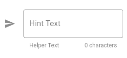
icon: Icon(Icons.send, color: Colors.white),
// 각 Text들의 위치는 첨부한 그림 참고. 스타일링은 각각 Style 속성이 있음.
helperText: 'Put city you want',
counterText: '0 characters need!',
hintText: 'Enter a search term',
hintStyle: TextStyle(color: Colors.grey)
// label 입니다. 필드를 클릭하면 자동으로 위로 올라가는 애니메이션이 적용됩니다
labelText: "검색어"
),
),
decoration: InputDecoration(
  hintText: 'Put your task',
  // 창 앞에 올 아이콘
  prefixIcon: Icon(Icons.add),

  // 가만히 있었을 때의 border
  enabledBorder: OutlineInputBorder(
    borderSide: BorderSide(color: Colors.red),
    borderRadius: BorderRadius.all(Radius.circular(45.0)),
  ),
  // focus 되었을 대의 border
  focusedBorder: OutlineInputBorder(
    borderSide: BorderSide(color: Colors.purple),
    borderRadius: BorderRadius.all(Radius.circular(15.0)),
  ),
),
- DropdownButton
보통 items는 for나 map을 돌려서 리스트를 만들어서 리턴한다.
DropdownButton<String>(
  // 초기값
  value: selectedCur,
  // 버튼을 클릭시 나오는 것. child는 표기, value는 값
  items: [
    DropdownMenuItem(child: Text('USD'), value: 'USD'),
    DropdownMenuItem(child: Text('EUR'), value: 'EUR'),
    DropdownMenuItem(child: Text('GBP'), value: 'GBP'),
  ],
  // 바꿨을 때의 동작
  onChanged: (value) {
    setState(() {
      selectedCur = value;
    });
  }),
- CupertinoPicker
(https://api.flutter.dev/flutter/cupertino/CupertinoPicker-class.html)
안드로이드에서는 DropDownButton을 쓰고 iOS에서는 CupertinoPicker를 사용하는게 친화적이다. 플랫폼을 감지하여 필요한 것으로 변환될 수 있게 코딩하는게 좋다. dart.io 플랫폼의 platform.dart 안에 있는 Platform 클래스를 활용하자.
관련 내용은 (https://darrengwon.tistory.com/395)에서 확인하자.
CupertinoPicker(
  backgroundColor: Colors.lightBlue,
  // 각 요소의 높이
  itemExtent: 38.0,
  // 아이템 바꿨을 때 실행할 값. 인자로 index
  onSelectedItemChanged: (int selectedIndex) {
     print(selectedIndex);
  },
  // List를 줘야 함.
  children:currenciesList.map((currency) => Text(currency)).toList(),
),
- StreamBuilder
실시간 채팅, 동영상, 음악 등의 스트림 형태의 정보를 처리하는데 유용합니다.
StreamBuilder : (https://api.flutter.dev/flutter/widgets/StreamBuilder-class.html)
StreamBuilder의 두번째 인자로 bulder가 들어갑니다. 이 때 builder는 AsyncWidgetBuilder여야 합니다.(https://api.flutter.dev/flutter/widgets/AsyncWidgetBuilder.html)
firestore 인스턴스에 collection의 snapshot을 가져온 후
해당 스냅샷의 hasData를 검증하고 .data.documents에서 해당 컬렉션의 도큐먼트를 모두 가져옴
모든 도큐먼트를 대상으로 for문을 돌려가며 각 도큐먼트의 data로 내용에 접근한다.
StreamBuilder(
  // stream은 최종적으로 스냅샷을 반환합니다.
  // 도큐먼트의 createAt을 기준으로 정렬해서 가져옵니다
  stream: _firestore.collection('messages').orderBy('createdAt').snapshots(),

  // 반환한 스냅샷을 이용해 builder를 구성해봅시다.
  builder: (context, snapshot) {

    // stream에서 받아온 스냅샷이 data가 null이 아니라면.
    if (snapshot.hasData) {

      // 해당 스냅샷의 data에는 정보가 담겨 있습니다. 그 data에서 documents로 도큐먼트를 꺼냅시다
      // reversed를 통해 역순으로 가져오겠습니다
      final messages = snapshot.data.documents.reversed;

      // 위젯을 담을 리스트 선언
      List<Widget> messageWidgets = [];

      // 앞서 만든 messages를 for문을 돌려
      for (var message in messages) {

        final messageText = message.data['text'];
        final messageSender = message.data['sender'];

        final messageWidgetItem = Text(
          '$messageText from $messageSender',
          style: TextStyle(color: Colors.white),
        );

        // 앞서 선언한 리스트에 위젯을 넣어둡시다.
        messageWidgets.add(messageWidgetItem);
      }
       return Column(
        // for문을 다 돌면 위젯이 든 리스트를 Column에 담아 반환합니다.
        children: messageWidgets,
      );
    }
  },
),
- CircularProgressIndicator() / LinearProgressIndicator()
플러터가 내장으로 가지고 있는 스피너/라인프로그레스 입니다. 비동기적인 일을 처리할 때(대부분 네트워크 데이터 페칭할 때죠)와 같이 대기 시간이 요구될 때 사용하여 유저에게 무언가 로직이 실행되고 있음을 알려주는 데 용이합니다.
https://api.flutter.dev/flutter/material/CircularProgressIndicator-class.html
https://api.flutter.dev/flutter/material/LinearProgressIndicator-class.html
- flexible
(https://api.flutter.dev/flutter/widgets/Flexible-class.html)
레이아웃 간의 비율을 설정하기에 좋습니다.
뿐만 아니라 overflow되는 부분을 Flexible로 감싸면 자동으로 크기를 줄여줍니다.
다음과 같은 크기를 했을 때 height는 200 까지 Hero 애니메이션으로 움직이지만 Flexible로 감싸 놓았으므로 overflow가 되면 줄여서 반영됩니다.
Flexible(
  child: Hero(
    tag: 'logo',
    child: Container(
      height: 200.0,
      child: Image.asset('images/logo.png'),
    ),
  ),
),
- Expanded
쉽게 말해 꽉차게 늘리는 겁니다.
https://api.flutter.dev/flutter/widgets/Expanded-class.html
https://darrengwon.tistory.com/377
- Material
Container가 div면 Material은 span 같은 개념입니다.
Material(
  borderRadius: BorderRadius.only(topLeft: Radius.circular(30.0)),
  elevation: 5.0,
  color: Colors.blueAccent,
  child: Padding(
    padding: EdgeInsets.symmetric(horizontal: 15.0, vertical: 10.0),
    child: Text(
      '$messageText',
      style: TextStyle(color: Colors.white, fontSize: 20.0),
      textAlign: TextAlign.end,
    ),
  ),
),
아무 의미 없는 위젯인 줄 알았으나 알고 보니 중요한 역할을 하는 위젯이었습니다!
관련 내용은 https://darrengwon.tistory.com/611
- checkbox
https://api.flutter.dev/flutter/material/Checkbox-class.html
Checkbox class - material library - Dart API
A material design checkbox. The checkbox itself does not maintain any state. Instead, when the state of the checkbox changes, the widget calls the onChanged callback. Most widgets that use a checkbox will listen for the onChanged callback and rebuild the c
api.flutter.dev
- BottomSheet / showModalBottomSheet
(https://api.flutter.dev/flutter/material/BottomSheet-class.html)
두 가지 bottomsheet 가 있습니다.
- Persistent. A persistent bottom sheet shows information that supplements the primary content of the app. A persistent bottom sheet remains visible even when the user interacts with other parts of the app. Persistent bottom sheets can be created and displayed with the ScaffoldState.showBottomSheet function or by specifying the Scaffold.bottomSheet constructor parameter.
- Modal. A modal bottom sheet is an alternative to a menu or a dialog and prevents the user from interacting with the rest of the app. Modal bottom sheets can be created and displayed with the showModalBottomSheet function.
FAB를 누를 때마다 Modal 형 BottomSheet가 올라오도록 작성해보았습니다.
여기서 isScrollControlled는, bottomSheet에 키보드와 같은 아래에서 올라오는 것이 있을 경우 bottomsheet를 밀어 올리게 할 것이냐, 덮어쓸 것이냐는 결정합니다. bottomSheet에 TextField를 사용할 예정이라면(그래서 키보드가 올라올 예정이라면) true로 값을 줍시다.
FloatingActionButton(
        onPressed: () {
          showModalBottomSheet(
              context: context,
              isScrollControlled: true,
              builder: (BuildContext context) {
                return Container();
              });
        }
)
만약 위와 같이 isScrollControlled만 true로 줄 경우, 키보드가 올라오면 bottomsheet는 모든 화면에 꽉 찹니다.
키보드가 올라온 만큼만 bottomsheet를 올리고 싶다면 미디어쿼리를 이용하여 다음과 같이 합니다.
SigleChildScrollView로 감싼 후 Container로 다시 한 번 감쌉니다. 해당 Container의 bottom에는 viewInsets.bottom 만큼만 padding을 줍니다.
showModalBottomSheet(
    context: context,
    isScrollControlled: true,
    builder: (BuildContext context) {
      return SingleChildScrollView(
        child: Container(
            padding: EdgeInsets.only(
                bottom: MediaQuery.of(context).viewInsets.bottom),
            child: AddTaskScreen()),
      );
    });
여기서 bottomsheet의 테두리를 둥글게 radius를 주는게 약간 귀찮습니다. 우선 모달이 뜰 때 뒤에 화면에 0fxx757575 을 주어서 뒷 배경과 색을 맞춘 후, 그 자식 요소로 모서리를 깎은 컨테이너를 반환해야 합니다. 상위 컨테이너에 radius를 주면 먹지 않습니다.
showModalBottomSheet(
      context: context,
      builder: (BuildContext context) {
        return AddTaskScreen();
      });


class AddTaskScreen extends StatelessWidget {
  @override
  Widget build(BuildContext context) {
    return Container(
      color: Color(0xff757575),
      child: Container(
        decoration: BoxDecoration(
          color: Colors.white,
          borderRadius: BorderRadius.only(
            topLeft: Radius.circular(25.0),
            topRight: Radius.circular(25.0),
          ),
        ),
        child: Center(
          child: Text("what"),
        ),
      ),
    );
  }
}
- DefaultTabController / TabBarView / TabBar / Tab
(https://api.flutter.dev/flutter/material/DefaultTabController-class.html)
DefaultTabController는 Scaffold를 child로 감싸서 활용합니다.
- DefaultTabController가 감싼 Scaffold의 body에는 각 탭이 움직일 때마다 무슨 화면을 보여줄 것인지 TabBarView를 줘서 무엇을 표시할 것인지를 결정합니다.
- TabBarView의 NeverScrollableScrollPhysics은 사용자가 손가락으로 탭 페이지를 넘기는 기능을 막습니다.
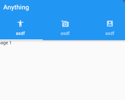
DefaultTabController/TabBar/ TabBarView를 설정해보았습니다.
class Home extends StatefulWidget {
  const Home({
    Key key,
  }) : super(key: key);

  @override
  _HomeState createState() => _HomeState();
}

class _HomeState extends State<Home> {
  @override
  Widget build(BuildContext context) {
    return DefaultTabController(
      length: 3,
      child: Scaffold(
        appBar: AppBar(
          title: Text("Anything"),
          bottom: TabBar(tabs: <Widget>[
            Tab(icon: Icon(Icons.accessibility), text: "asdf"),
            Tab(icon: Icon(Icons.add_a_photo), text: "asdf"),
            Tab(icon: Icon(Icons.account_box), text: "asdf"),
          ]),
        ),
        body: TabBarView(children: [
          Container(child: Text("page 1")),
          Container(child: Text("page 2")),
          Container(child: Text("page 3")),
        ]),
      ),
    );
  }
}
결과는 다음과 같이 생겼습니다.
TabBar는 다음과 같이 사용합니다.
TabBar(
  // 선택된 탭의 색깔
  labelColor: Colors.white,

  // 선택되지 않은 탭의 색깔
  unselectedLabelColor: Colors.white70,

  // 탭의 하단에 움직이는 바의 색깔
  indicatorColor: Colors.transparent,
  tabs: <Widget>[
    Tab(icon: Icon(Icons.home)),
    Tab(icon: Icon(Icons.home)),
    Tab(icon: Icon(Icons.home)),
    Tab(icon: Icon(Icons.home)),
  ],
NeverScrollableScrollPhysics 속성 때문에 하단 바로는 움직이지만 페이지를 옆으로 넘겨서 이동하는 것은 불가능합니다.
- Stack
(https://api.flutter.dev/flutter/widgets/Stack-class.html)
쉽게 말해 위젯을 z-index로 쌓을 수 있게 된다.
아래와 같은 코드는 Carousel 위로 TopBar가 쌓이게 된다. 차례대로 쌓이게 되는 것이다. (FILO)
Stack(
  children: <Widget>[Carousel(movies: movies), TopBar()],
)
- AnimatedContainer / AnimatedOpacity
(https://api.flutter.dev/flutter/widgets/AnimatedContainer-class.html)
(https://api.flutter.dev/flutter/widgets/AnimatedOpacity-class.html)
AnimatedContainer : 간단한 애니메이션을 구현할 수 있습니다. 일반 Container가 가지고 있는 속성에 추가로 duration과 curves 속성이 존재합니다.
FAB를 누를 때마다 랜덤하게 색과 폭, 높이를 변화하는 애니메이션을 하나 만들어보았습니다.
속성으로 주는 가로 세로 값은 double이어야만 합니다. toDobule 메서드를 애용합시다.
class Home extends StatefulWidget {
  const Home({
    Key key,
  }) : super(key: key);

  @override
  _HomeState createState() => _HomeState();
}

class _HomeState extends State<Home> {
  double _width = 50;
  double _height = 50;
  Color _color = Colors.green;

  @override
  Widget build(BuildContext context) {
    return Scaffold(
      floatingActionButton: FloatingActionButton(
        child: Icon(Icons.add),
        onPressed: () {
          setState(() {
            final random = Random();
            _width = random.nextInt(300).toDouble();
            _height = random.nextInt(300).toDouble();
            _color = Color.fromRGBO(random.nextInt(126), random.nextInt(126),
                random.nextInt(126), 1);
          });
        },
      ),
      appBar: AppBar(title: Text("middle")),
      body: Center(
          child: AnimatedContainer(
        width: _width,
        height: _height,
        decoration: BoxDecoration(
            borderRadius: BorderRadius.circular(8), color: _color),
        duration: Duration(seconds: 1),
        curve: Curves.fastOutSlowIn,
      )),
    );
  }
}
transfom을 통해서 화면 사이즈를 조정하는 방식으로 탭을 열 수 있도로 만들어 보았습니다.
  Widget _sideMenu() {
    return AnimatedContainer(
      duration: Duration(milliseconds: duration),
      color: Colors.grey,
      curve: Curves.easeInOut,
      transform: Matrix4.translationValues(
          _menuOpened ? _size.width - menuWidth : _size.width, 0, 0),
    );
  }

  Widget _profile() {
    return AnimatedContainer(
      duration: Duration(milliseconds: duration),
      color: Colors.redAccent,
      curve: Curves.easeInOut,
      transform: Matrix4.translationValues(_menuOpened ? -menuWidth : 0, 0, 0),
    );
  }
AnimatedOpacity는 opacity만 바꿀 수 있습니다.
FAB를 누를 때마다 보이고 안 보이게 왔다갔다 하도록 작성해보았습니다.
삼항 연산자가 쓰였는데 JS에서 쓰던 그대로입니다!
class Home extends StatefulWidget {
  const Home({
    Key key,
  }) : super(key: key);

  @override
  _HomeState createState() => _HomeState();
}

class _HomeState extends State<Home> {
  bool _opacity = true;

  @override
  Widget build(BuildContext context) {
    return Scaffold(
      appBar: AppBar(title: Text("test")),
      floatingActionButton: FloatingActionButton(
        onPressed: () {
          setState(() {
            _opacity = !_opacity;
          });
        },
        child: Icon(Icons.play_arrow),
      ),
      body: AnimatedOpacity(
          opacity: _opacity ? 1.0 : 0.0,
          duration: Duration(seconds: 1),
          child: Center(
              child: Container(width: 200, height: 200, color: Colors.green))),
    );
  }
}
- AnimatedIcon
(https://api.flutter.dev/flutter/material/AnimatedIcon-class.html)
아이콘인데 애니메이션 처럼 움직입니다.
progress에 animation controller를 줘야 하는데 이 과정이 조금 까다롭습니다.
AnimationController 위젯을 이용해서 controller를 만듭시다.
AnimatedIcon(
  icon: AnimatedIcons.menu_arrow,
  progress: controller,
  semanticLabel: 'Show menu',
)
- AnimationController
(https://api.flutter.dev/flutter/animation/AnimationController-class.html)
initState를 통해 animation controller를 만들어주었습니다.
dispose 때 해당 애니메이션 컨트롤러를 제거해주어야 합니다. memory leak이 발생할 수 있거든요~
  @override
  void initState() {
    _animationController = AnimationController(
      vsync: this,
      duration: Duration(microseconds: duration),
    );
    super.initState();
  }

  @override
  void dispose() {
    _animationController.dispose();
    super.dispose();
  }
- OrientationBuilder
(https://api.flutter.dev/flutter/widgets/OrientationBuilder-class.html)
기기의 가로, 세로에 따라 레이아웃을 바꾸고자 할 때 사용합니다.
일반적으로 핸드폰을 가로로 눕히면 디스플레이가 넓어지고 스크롤을 내려서 내용을 확인하게 됩니다. 이렇게 가로로 회전할 경우 레이아웃을 바꿀 필요가 있을 때 사용하면 됩니다.
Orientation.portrait(세로) 면 그리드의 열이 3개고 눕히면 5개로 설정해보았습니다.
OrientationBuilder도 builder니까 builder 내부에 return으로 사용할 위젯을 줘야 합니다.
class Home extends StatefulWidget {
  const Home({
    Key key,
  }) : super(key: key);

  @override
  _HomeState createState() => _HomeState();
}

class _HomeState extends State<Home> {
  @override
  Widget build(BuildContext context) {
    return Scaffold(

        appBar: AppBar(title: Text("Test")),

        body: OrientationBuilder(

          builder: (BuildContext context, Orientation orientation) {

            return GridView.count(

              // Orientation.portrait(세로) 면 그리드의 열이 3개고 눕히면 5개
              crossAxisCount: orientation == Orientation.portrait ? 3 : 5,

              children: List.generate(50, (index) {
                return Center(
                  child: Text(
                    "item $index",
                  ),
                );
              }),
            );
          },
        ));
  }
}
OrientatOrientationBuilderion
-Builder
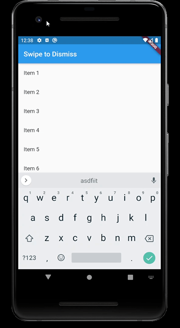
- Dissmissible
(https://flutter.dev/docs/cookbook/gestures/dismissible)
다른 위젯을 감싸게 되면 스와이프해서 지울 수 있게 됩니다.
class Home extends StatefulWidget {
  const Home({
    Key key,
  }) : super(key: key);

  @override
  _HomeState createState() => _HomeState();
}

class _HomeState extends State<Home> {

  // 실습을 위한 리스트 생성 [Item 1, Item 2, ...]
  final items = List<String>.generate(20, (index) => "Item ${index + 1}");

  @override
  Widget build(BuildContext context) {
    return Scaffold(
      appBar: AppBar(title: Text("Swipe to Dismiss")),
      body: ListView.builder(

          // ListView.builder에 아이템 갯수를 명시해줍시다 (안하면 오류나요~)
          itemCount: items.length,

          itemBuilder: (context, index) {
            // itemCount가 명시한대로 반복 실행합니다.(일종의 for문)
            final item = items[index];

            return Dismissible(
              background: Container(color: Colors.red),

              // 어느 방향으로 스와이프?
              direction: DismissDirection.startToEnd,

              // 스와이프 뒤에 할 처리
              onDismissed: (direction) {
                setState(() {
                  if (direction == DismissDirection.startToEnd) {

                    // 스와이프하면 아이템 리스트에서 실제로 지웁니다.
                    items.removeAt(index);
                  }
                });
              },

              // for문을 돌렸으니 각 개체들을 식별하기 위한 key값이 필요합니다.
              key: Key(item),

              // 각 for문에서 출력할 ListTile입니다.
              child: ListTile(
                title: Text("${items[index]}"),
              ),
            );
          }),
    );
  }
}
- WillPopScope
(https://api.flutter.dev/flutter/widgets/WillPopScope-class.html)
(https://blog.naver.com/chandong83/221881103496)
플러터(Flutter) - Back Button 막기(Disable Back Button)
안드로이드의 경우 하단에 바에 있는 백 키(Back Key or Back Button)를 눌러 이전 페이지(Activity)...
blog.naver.com
종종 앱에서 뒤로가기 버튼을 눌렀을 때 값이 엉켜서 오류를 뱉는 경우가 있다. 이럴 때는 아예 뒤로가기를 막아서 특정 버튼을 눌러서만 이동하게끔 만들게 할 수 있다. Scaffold를 WillPopScope 감싸거나 Scaffold의 Body 속성을 WillPopScope로 감싸면 된다. 효과는 같다.
또, WillPopScope를 이용해서, 뒤로 가기 버튼을 이용 시 팝업을 띄워, 정말로 이동(혹은 종료)하겠냐는 창을 띄울 수도 있다.
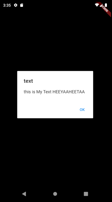
- AlertDialog
class AlWidget extends StatefulWidget {
  @override
  _AlWidgetState createState() => _AlWidgetState();
}

class _AlWidgetState extends State<AlWidget> {
  @override
  Widget build(BuildContext context) {
    return AlertDialog(
      title: Text("text"),
      content: Text("this is My Text HEEYAAHEETAA"),
      actions: <Widget>[
        FlatButton(onPressed: () {  },
        child: Text("OK"),)
      ],
    );
  }
}
'📱 Mobile > 📱 (old) Flutter v 1.0' 카테고리의 다른 글
| fluttertoast 라이브러리를 이용한 toast 구현 (0) | 2020.05.15 |
|---|---|
| BuildContext, builder를 이해하기 위한 SnackBar (0) | 2020.05.15 |
| 속성 정의가 길어질 때 Widget 분리 (0) | 2020.05.14 |
| 외부 라이브러리 사용 (0) | 2020.05.14 |
| GridView : SliverGridDelegateWithFixedCrossAxisCount (0) | 2020.05.14 |