잘 쓸 수 있지만 흔히 볼 수는 없는 속성들을 모아 보았다.
- filter
filter와 grayscale을 이용해 평소에는 흑백이었다가 hover하면 색깔을 주는 효과를 내보았다.
img {
  filter: grayscale(1);
}

img:hover {
  filter: grayscale(0);
}
- background-attachment
스크롤해도 뒷배경이 움직이지 않습니다. 이런 특징을 Parallax라고 합니다.
.background {
  background-image: url("./img/C0002T01.JPG");
  background-attachment: fixed;
}
- text-indent
들여쓰기를 할 수 있다.
text-indent: 30%
- line-height(줄간격) / letter-spacing(자간)
줄간격을 설정할 수 있다.
line-height: 1.2;
letter-spacing: 1.2;
- text-align
가운데 정렬, 왼쪽 정렬 등 글자 정렬 설정
text-align: center;
- vertical-align
상하의 글자, 이미지 정렬.
img.a {
  vertical-align: baseline;
}

img.b {
  vertical-align: text-top;
}

img.c {
  vertical-align: text-bottom;
}

img.d {
  vertical-align: sub;
}

img.e {
  vertical-align: super;
}
- overflow ( overflow-x, overflow-y)
해당 바스 내에 내용물이 넘칠 경우 보여줄 것인지, 숨길 것인지, 스크롤을 만들어 줄 것인지 설정합니다.
overflow: auto;CSS - overflow 속성 사용하기
CSS의 overflow 프로퍼티는 요소내의 컨텐츠가 너무 커서 요소내에 모두 보여주기 힘들때 그것을 어떻게 보여줄지를 지정합니다. 기본적으로 컨텐츠를 포함하고 있는 요소의 크기가 고정되어 있지 않다면 컨텐츠를..
offbyone.tistory.com
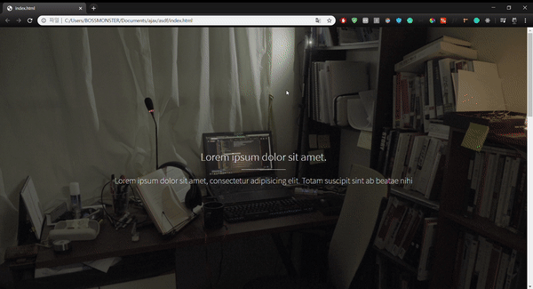
- outline
자세히 보면, input을 클릭할 때 푸른색의 외곽선이 나타나는 것을 볼 수 있다. 이를 제거하기 위해서는 outline을 none으로 작성한다.
outline: none;
- !important
겹치는 속성이 있을 경우 해당 내용을 반영하도록 강제하는 기능
아래의 예시로 들자면 강제로 색깔은 red가 된다. !important가 있기 때문이다.
이 기능은 다른 디자인 라이브러리를 사용할 때 덮어쓰는 용도로 유용하다.
p {
    color: red !important;
}

#thing {
    color: green;
}

<p id="thing">Will be RED.</p>
- pointer-events
css 에서 버튼이 가진 내부 태그들의 이벤트를 막아줄 수 있습니다.
pointer-events를 none으로 주어서 이벤트 자체를 막고, 해당 포인터를 감싸고 있는 부모 태그의 이벤트를 받도록 만들 수 있습니다.
.btn-label {
  pointer-events: none;
}
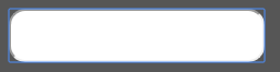
- word-wrap, white-space
textarea를 사용할 때 주로 사용됩니다.
https://darrengwon.tistory.com/681
textarea를 사용할 때의 문제점과 그 해결법
게시판의 댓글에는 주로 태그를 사용할 것입니다. 그런데 textarea를 사용하게 되면 관습적으로 직면하는 부분이 있어서 그 부분에 대해서 다뤄봤습니다. 1. 내용이 길어질 때 정해진 box를 벗어나�
darrengwon.tistory.com
word-wrap: break-word;
white-space: pre-wrap의 경우 textarea에 입력한 줄바꿈을 그대로 출력하는데 꼭 필요합니다.
white-space: pre-wrap;
이게 감이 잘 안올 수 있는데 아래와 같이 됩니다.
.first{
  white-space:nowrap;
}
.second{
  white-space:pre;
}
.third{
  white-space:pre-line;
}
.fourth{
  white-space:nowrap;
  text-overflow:ellipsis;
  overflow:hidden;
}
- text-overflow, 말줄임표
주어진 박스보다 더 텍스트가 많아지면 어떻게 할 지 대처합니다. 여기서는 말줄임표로 줄이기로 했습니다.
https://darrengwon.tistory.com/133?category=858364
브라우저가 줄어들면 말줌임표로 대체하기
본래 CSS 패턴을 외워두는 것은 별로 좋은 일은 아니지만 자주 쓰는 속성은 외워두는 것도 나쁘지 않다. overflow: hidden; text-overflow: ellipsis; white-space: nowrap; overflow를 내리지 않고 숨기고 text-..
darrengwon.tistory.com
  overflow: hidden;
  text-overflow: ellipsis;
  white-space: nowrap;
- content
해당 태그의 :before, :after 속성과 함께 사용된다. content로 텍스트를 추가할 수 있다.
.count {
  grid-area: count;
  &:before {
    content: "조회수: ";
  }
}
모바일 환경에 있을 때 조회수라는 문자열을 추가하도록 만들어보았다.
- hover-zoom
https://w3bits.com/labs/css-image-hover-zoom/
10 Slick n' Simple CSS-only Image Hover-Zoom Effects
A bunch of some cool mouseover zoom effects for images pulled with just plain CSS and nothing more. Demo the effects and then grab the code for free!
w3bits.com
- backdrop-filter
애플 사이트에 가보시면 헤더가 투명하고, 뒤에 있는 내용이 블러 되는 것을 볼 수 있습니다.
backdrop-filer를 이용하시면 쉽게 만들 수 있습니다.
background-color: rgba(255, 255, 255, 0.5);
backdrop-filter: blur(4px);
- all
CSS 프레임웤 쓰다보면 오버라이딩해야 하는데 대개 !important를 붙여서 덮어 쓰기를 했습니다.
그런데 모든 내용들을 !important로 덮어 쓰려고 하다보면 상당히... 귀찮죠.
.header{
	color: blue !important;
	font-size: 14px !important;
}
여기서 all을 쓰면 한결 편해집니다.
There are 3 property values of all — initial, inherit, and unset.
.header{
	all:initial;
	color: blue;
	font-size: 14px;
}
all:initial sets all the properties of the element to their fallback or initial values.
Chrome and Firefox support this property starting version 37 and version 27 respectively. This property is also supported on Edge browser, but not on Internet Explorer.
- writing-mode
세로 쓰기 디자인 많이 보셨죠? writing mode로 한겁니다.
쓰기 모드와 CSS 레이아웃 - Webactually
레이아웃 제작에 쓸 수 있는 여러 기술에 관련한 명세를 명쾌하게 설명해 CSS 작동 원리의 이해를 돕는 《새로운 CSS 레이아웃》의 저자 레이철 앤드루, 그녀가 CSS 레이아웃과 CSS 전반에 쓰기 모
webactually.com
- img 태그에 gradient 적용하기
stackoverflow.com/questions/17955536/adding-a-css-gradient-to-an-image-not-a-background-image
background-image: gradient가 아니라 img 위에 gradient를 적용하는 방법이다.
:before 가상 선택자를 통해 gradient를 줄 수 있다.
<div class='slideshow-wrapper'>
    <img src='http://www.placekitten.com/800/300'/>
    <h2 class='title'>Some title</h2>
</div>
.slideshow-wrapper {
position:relative;
}
.slideshow-wrapper:before {
content: '';
position:absolute;
top:0;
left: 0;
right: 0;
bottom: 0;
background: linear-gradient(to bottom, rgba(0,0,0,0) 0%,rgba(0,0,0,1) 100%);
}

- hr 태그의 이중선을 제거하는 방법
border를 완전 제거한 다음, height로 두께를 설정하고, background로 색을 주는게 가장 직관적이고 깔끔하게 보인다.
hr {
  border: none; // 아예 border를 없애는 게 좋음
  height: 1px; // 높이 주자
  text-align: center;
  overflow: visible;

  // 색은 background로 주자
  background: #bbb;
  background-image: -webkit-linear-gradient(left, #eee, #777, #eee);
  background-image: -moz-linear-gradient(left, #eee, #777, #eee);
  background-image: -ms-linear-gradient(left, #eee, #777, #eee);
  background-image: -o-linear-gradient(left, #eee, #777, #eee);
}
medium.com/javascript-in-plain-english/6-css-properties-nobody-is-talking-about-e6cab5138d02
6 CSS Properties Nobody Is Talking About
Interesting properties that many have never heard of before.
medium.com
'웹 전반, 브라우저 > HTML, CSS' 카테고리의 다른 글
| svg (0) | 2020.06.17 |
|---|---|
| Fragment(#) 사용하기, Hashbang(#!) (0) | 2020.04.07 |
| form, input 태그 + etc (0) | 2020.03.27 |
| box-shadow에 대해서 (0) | 2020.03.16 |
| 브라우저가 줄어들면 말줌임표로 대체하기 (0) | 2020.03.09 |