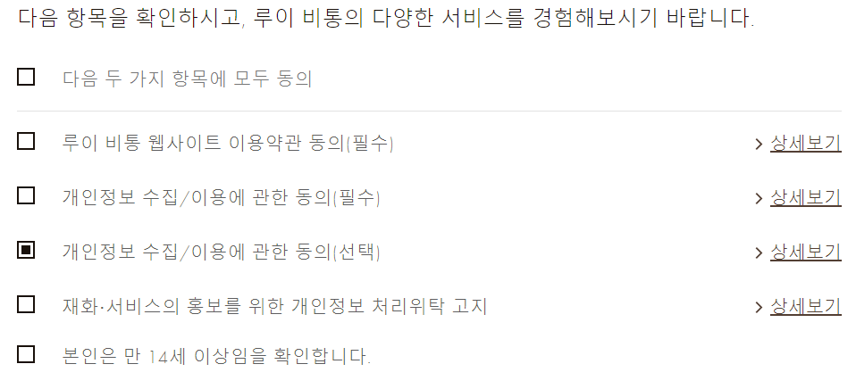
이번 프로젝트에서 아래와 같이 체크 박스를 스타일링해야 할 일이 생겼다.
1. ::before, ::after 가상 선택자 스타일링은 input, image에서는 동작하지 않는다.
쓰지 마세요.. 의미 없이 시간을 날렸...
참고: stackoverflow.com/questions/2587669/can-i-use-a-before-or-after-pseudo-element-on-an-input-field
input[type='checkbox'] {
   &:checked {
    // 안 된다.
    &::after {
      content: '';
      background: red;
      padding: 1px 4px;
    }
  }
}
2. appearance로 기본 스타일링은 날릴 수 있지만, 이용하지 않는 것이 좋다.
왜냐하면 checkbox가 check되었을 때의 내부를 가상 선택자로 스타일링하는 것이 불가능하기 때문이다.
게다가 appearance는 일부 ie에서 동작하지 않는다고 하네요. 애초에 ie에서는 가상 선택자조차 인식하지 못합니다.
가상 선택자를 이용하지 않고 다른 html 태그 sibling으로 넣어서, checkbox는 position: relative로 잡고, 추가한 html 태그를 position:absolute로 억지로 밀어 넣겠다면 사용해도 됩니다.
// appearance로 설정은 할 수 있다만...
input[type='checkbox'] {
  // 모든 스타일링 삭제
  -webkit-appearance: none;
  -moz-appearance: none;
  -o-appearance: none;
  appearance: none;
3. checkbox를 display: none으로 놓고, 커스텀 박스를 만드는 것이 수명 연장에 도움이 된다. 만약 box 안에 화살표, 체크 등을 넣고 싶다면 가상 선택자의 content로 넣자.
가급적 코드가 verbose해지는 게 싫어서 용을 써봤는데 결국 이렇게 되더라구요.
한끗 차이로, 클릭되었을 때 애니메이션도 딱! 넣어주면 더 고급스러워보입니다.
// 일반 input 박스는 숨기자
input[type='checkbox'] {
  display: none;
}
 // input 옆에 있는 dom을 스타일링하여 체크 박스를 만든다.
input[type='checkbox'] + .stylish-checkbox {
  width: 16px;
  height: 16px;
  border: 2px solid black;
  cursor: pointer;
   position: relative; // ::after contnet 정렬용
  display: flex;
  justify-content: center;
  align-items: center;
}

// 체크되었을 때의 스타일링
input[type='checkbox']:checked + .stylish-checkbox {
  &::after {
    content: '✔';
    padding: 0;
    margin: 0;
    animation: ${ZoomIn} 0.1s ease;
  }
}
ㅅㅌㅊ
* React로 짠, component 로직
머리를 조금 굴려보면 그냥 짤 수 있는 내용이긴 하지만, 참고해보시라고 올려둡니다.
직접 onChange로 넘기지 않고, 한번 함수로 wrapping해서 일반 체크 로직은 generalInputFunc로, 모두 동의는 setAllAgreeFunc로 해보았습니다.
function CheckBox({ text, checked, onChange }: ICheckBoxProps) {
  const changeFunc = () => {
    if (onChange) {
      onChange();
    }
  };

  return (
    <S.CheckBox>
      <div className="check-input-wrapper">
        <input type="checkbox" id={text} name={text} checked={checked} onChange={changeFunc} />
        <label htmlFor={text}>{text}</label>
      </div>
    </S.CheckBox>
  );
}
function SignUp() {
const [contact, setcontact] = useState(false);
const [privacy, setprivacy] = useState(false);
const [isAllTrue, setisAllTrue] = useState(false);
const generalInputFunc = (state: boolean, setState: Function) => {
setState(!state);
};
const setAllAgreeFunc = () => {
if (isAllTrue) {
setisAllTrue(false);
// 나머지
setcontact(false);
setprivacy(false);
} else {
... 중략
}
};
return (
<S.Wrapper>
<div>Fuze 계정 생성</div>
<div>회원 약관 확인 (1/2)</div>
<S.CheckBoxWrapper>
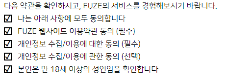
<div>다음 약관을 확인하시고, FUZE의 서비스를 경험해보시기 바랍니다.</div>
<div className="check-box">
<CheckBox text={'나는 아래 사항에 모두 동의합니다'} checked={isAllTrue} onChange={() => setAllAgreeFunc()} />
<div>상세보기</div>
</div>
<form>
<div className="check-box">
<CheckBox text={'FUZE 웹사이트 이용약관 동의 (필수)'} checked={contact} onChange={() => generalInputFunc(contact, setcontact)} />
<div>상세보기</div>
</div>
<div className="check-box">
<CheckBox text={'개인정보 수집/이용에 대한 동의 (필수)'} checked={privacy} onChange={() => generalInputFunc(privacy, setprivacy)} />
<div>상세보기</div>
</div>
</form>
</S.CheckBoxWrapper>
</S.Wrapper>
);
}
'웹 전반, 브라우저 > HTML, CSS' 카테고리의 다른 글
| swiper 그만 하고 glide 합시다 (0) | 2021.03.09 |
|---|---|
| mailto 프로토콜을 통해 메일을 수발신을 해보자 (0) | 2021.02.09 |
| 모바일 웹 앱에서 100vh가 일정하게 유지되지 않는 문제 (0) | 2020.09.06 |
| 마진 병합 현상과 방지 방법 (0) | 2020.09.05 |
| 이미지를 위한 object-fit, object-position (0) | 2020.08.02 |